Refreshing Orchard Toys: Creative Manager Kevin Dobson discusses updating the company’s packaging
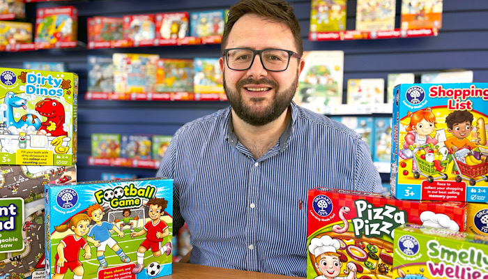
Hi Kevin! Lovely to meet you. I’m sorry our paths didn’t cross at London Toy Fair – but the Orchard Toys stand looked amazing!
Thank you, Deej! Lovely to meet you, too. I wasn’t at London Toy Fair this year – but I did hear your kind feedback. Thank you!
Not at all; my pleasure. Now in the past, of course, Mojo Nation has spoken to your colleagues Heather Yates, Rowena Isotta-Day and Alice Morley… By some magic, their names will turn into links so readers can find out more about Orchard Toys. The reason I wanted to interview you, though, is because of your work updating the Orchard Toys packaging. Before we come to that, what are your general responsibilities at Orchard Toys?
Well, I’m the Creative Manager and I’ve been here exactly ten years! In general, my responsibilities are overseeing anything creative and design related within the company, be it product or marketing-wise – a brand guardian as such! We don’t outsource anything here, except the manufacture; everything you see on an Orchard Toys product is designed here: from the concept that one of the design team has come up with all the way through to final artwork – which is where I tend to come in and get the packaging as polished as it can possibly be.
A lot going on, then!
Always a lot going on! We’ve got a small but wonderfully talented team of in-house illustrators and designers here, some of whom you mentioned just now, who all generate ideas for exciting new products. So the game artwork, layouts, sketches – the concepts all come from them. I’ll usually come into play to work on the artwork style of the packaging. Alongside our core range of products, we’ll also be working on our Baby and Toddler range, licensed ranges – including Bluey and Peter Rabbit – and bespoke lines for supermarkets and other customers.
You mean like white-label work?
No, not quite! We do exclusive designs for some of the big supermarkets and toy stores, for example. The product still looks like it’s Orchard Toys, but it’s a range just for them.
I had no idea! But then, I suppose that’s because I tend to think that Orchard Toys has got that distinct, signature look… It’s very consistent. And you recently updated a lot of the packaging?
Yes, for the first time in a long time… Come to think of it, I last did it when I first started at Orchard Toys, which is around ten years ago. The original idea was for us to just update how our characters looked; the people. As we began, it morphed into a much bigger refresh – we redesigned the whole lot! Ha!
What were some of the changes you made? And what did you keep?
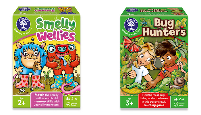
Well, we’ve kept our bold colour scheme, but we changed a lot! One of the big differences you’ll notice are the boxes and the orientation on shelf. We’ve turned some of our £10 games onto the short side so that they’re upright. The thinking was that going portrait would just give us a different canvas to work with and therefore a fresher look. In practical terms, though, we can now get seven of those boxes on a one-metre bay where we used to just get five. So I think that ‘shelf efficiency’ delivers more value for the retailers.
So getting more on shelf wasn’t the main driver?
No, I wasn’t given a remit to make it like this or like that because we need to sell more. It wasn’t that at all. It kind of came naturally out of looking at different things… box sizes, orientation and so on. It gave us a different canvas to work with, plus we’re all aware how tight space is in retail so it worked out well. On the front of the box, you can also see we’ve made our age ratings more prominent. They’re much bigger and bolder in the corner.
And less prescriptive, I see! They used to say age 3-6, didn’t they? Now it says 3+…
Yes! We figured that this helps quickly gives granny – or uncle or whoever is out there shopping for a child’s gift – a clear idea. It’s immediately very easily identifiable. That needed to be a bit more in your face, I think, to grab attention… Also, the age range formatting used to be inconsistent – sometimes 3+, other times 3-6, so we’ve standardised it across the board on all products. That reminds me! I once saw a graphic – I think for LEGO – that said something like age 3 to 99… And someone had posted a picture of a sad looking woman celebrating her 100th birthday on social media. The little caption said: “Does this mean I can’t play LEGO anymore?”
Ha! Very good. And actually, I think LEGO just played on that idea to celebrate David Attenborough’s 100th birthday. So let’s see… You’ve turned some product on its end. You’ve tweaked the age ranges and made those buttons bigger. You’ve updated the people while maintaining your unmistakable style. I’m curious: is that style enshrined in a style guide?
No, it’s just a house style – the Orchard Toys DNA! There are four different illustrators here and they all create that style. A lot of people might suppose we’ve just got one person doing it – since everything is so consistent in style – and that’s testament to them!
In addition, we didn’t use Beatrix Potter’s illustrations for our World of Peter Rabbit range, for example; we were fortunate enough to be given free reign to reillustrate in our Orchard Toys style which was just brilliant, and a real privilege! I’d love to say we had a beautifully designed brand bible that lays it all out, we don’t as such… We just know what we like and we like what we know, and that’s continuing to design our products in our wonderful, unmistakeable Orchard style.
Wow. From this conversation, it doesn’t feel like anything’s being driven just by an Excel spreadsheet – I love that!
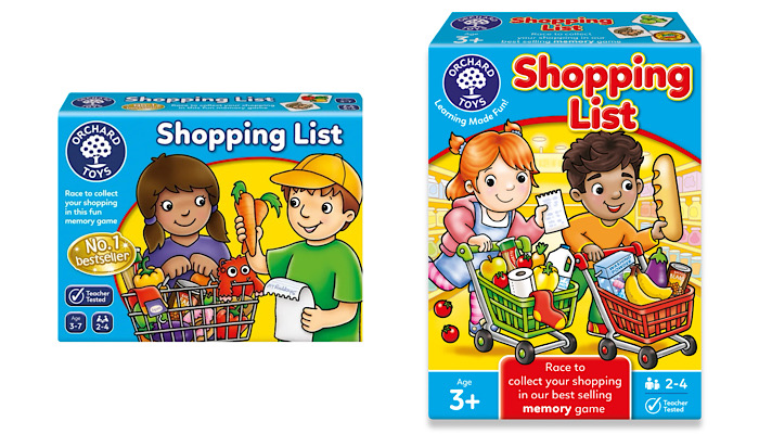
Well, the technical info is – but that’s about it! Going back to the actual illustration on our boxes, we’ve tried to bring in a lot more ‘breakout’ from the swoosh on the front of the packaging, trying to give it a bit more fun and movement; making the box front more more dynamic.
And when you say you’ve made it more dynamic, what does that mean? In terms that even I can grasp!
Ha! I’ll give you an example here, look… So this game is our older version of Shopping List. It’s looked like this for the last 15 years or so, but it’s a 30-year-old game. We sell oodles of them, but it was beginning to look tired… Two very static looking kids and they’ve got a list. With our new one, you’ve got the kids actually in the supermarket setting; they’re racing around to fill their trolley. And that’s more to the point of the game: race to collect your shopping in this best-selling memory game…
Got it!
Also, you can see the kids have been freshened up on the front. In some ways, Deej, what’s nice about this is that it’s not necessarily reinventing the wheel – it’s just about improving things, you know? Taking something already popular and gently improving it, modernising it. Orchard Toys is a very well-regarded and well-loved company; a leader in their field – so we didn’t want to make complete, wholesale changes; rather gently caressing it forward. Being a heritage brand, we have a robust approval system with many long-standing members of the company acting as ‘brand guardians’.
With all that in mind, Kevin, what’s the furthest you’ve gone in terms of pushing the design envelope in one go?
I’ve tried to give all the packaging a more individual look, while retaining the look of a ‘range’. All our titles used to be very regimented – using white text with a blue keyline. We’ve kept this style for some of our more educational products, but have really been able to look at more individual styles for others. For Pizza, Pizza, it looks like a logo you’d see on a pizza restaurant… It’s in keeping with the game and the theme – without taking it fully out of the range if you see what I mean…
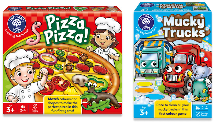
Similarly, the Mucky Trucks title features a big mud splat behind it to give it a distinct look. You’ve still got a bright colour in the background and you’ve still got our logo top left… You’ve still got your age and stuff at the bottom – but the pack now looks a bit more individual. Smelly Wellies has whiffy lines emanating from the title, Bug Hunters has a bug hidden in the ‘g’, and Unicorn Fun has a big fluffy cloud logo – but still with the easy-to-read fonts, obviously.
I’ve never really thought about this before: what makes a font easy to read?
Simple, well spaced and bold. We generally use a font that is educationally sound for both parents and children. It wouldn’t be italicized, by way of example, and not a serif…
Not a serif? What does that mean? No funny little feet at the bottom?!
Ha yes! Sans serif means no funny little feet!
Of course, I do know all of these technical terms. I just like to appear in incredibly naïve so that readers find me more relatable…
I believe you! All our products have a bold, rounded, sans font so that they’re easy to read, legible and simple; fonts that will be easily read by a child and parent alike. Similarly, for literacy reasons, you won’t see a Z stuck on the end of one of our titles!
Like no ‘kidz games’?!
Yes, you’ll never see that because it’s outright confusing for a child learning to read to see that. I guess the closest we’ve got to a misspelling or a punny name is on a dinosaur game about a sleeping T-Rex: Dino-Snore-Us.
Ha!
That’s about the limit! I’m sure we’ve also described something as “roar-some” before too! We don’t go crazy because we know our audience. We get people writing in to us and saying – very positively – we look at your toys as the leading light in learning and education standard for preschool games and puzzles. Sometimes it can be a challenge to win attention without being gimmicky because the base of the design is, obviously, a tried-and-tested method.
And with that in mind, Kevin, is it better to overreach and pull back on the design? Or play it safe and work up?
Oh, I’ve always worked the first way. It’s always easier to do something a little wild and then pare it back. I like to push it a bit –maybe not groundbreaking, but in our world, we can disrupt things a little every now and then and break from the standard template.
And have you any examples of that?
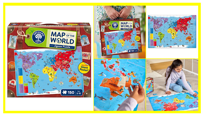
Sure! We have a big, beautifully illustrated 150-piece puzzle called Map of the World. It was calling out to me to be themed box and as it has a carry handle I decided to design it as a suitcase, with straps and travel stickers all over it. It just perfectly suits the theme; the idea that you grabbed this and go went off on holiday round the world! We’ve also got our At the Museum puzzle… For this, I asked our manufacturer customise the cutter guide and take the corners in on the top of the box…
Oh! So it looks like the museum’s roof! Love it! What’s your background, Kevin?
After I graduated from the Norwich University of the Arts in 2002, I went to work at a small design agency called Point Design in Essex. I was mentored there by a wonderful lady called Maria Kelly. Despite being a small company, they were on the design roster for both Tesco and Disney Store. I was quite surprised to learn that, at the time, Disney Store didn’t really have a big in-house creative-design team. As a result, we were working on all sorts of packaging, style guides and stuff…
Naturally, I was there as a junior at first, coming up with concepts and making mockups. I eventually got to work on packaging and realised I really enjoyed it. Disney Store would come to us and ask us to come up with all sorts of creative packaging ideas. For example, when the Cars film came out, they asked us to package up their flagship McQueen remote controlled car in a novel way. So, exploring various cardboard engineering ideas. I came up with a box that looked a red, old-style toolbox. This red styling, paired with a chequered flag border was then rolled out across the whole range. I also remember staying up late one night to come up with a design for the Cinderella range which was lovely and blue and sprinkled with silver foil block…
This would’ve been a re-release of something, presumably?
Exactly right. I think they were re-releasing the DVD. We had to come up with a style that would go across their whole Cinderella range – dolls, castles, puzzles and so on. During my time there, I also designed the graphics on a Pirates of the Caribbean pinball machine, some Narnia Christmas decorations and redesigned all of their carrier bags and gift boxes – never a dull moment!
We had access to loads of assets which proved useful when I had to design a Disney A-to-Z puzzle using their characters to represent the letters. I remember getting stuck on X and then tenuously shoehorning Stitch in as his proper name is Experiment 626 – so X626!
Ha! That’s rather fun! And that was with Point Design, did you say?
Yes. There were only three or four of us. We used to take great care in mocking things up and then courier them to Disney HQ in Hammersmith overnight. It was very hands-on work that helped me become more confident. It made me realise the beauty of coming up with creative ideas and I realised I had a real passion for it. Unfortunately, this dream set up didn’t last for too long – I was made redundant when some of the regular work dried up.
And after you were made redundant?
With a mortgage to pay, I took the first thing I could get and went to work for a signage and point of sale company in Great Yarmouth. I was involved in coming up with some design concepts for the National Lottery and Walls Ice Cream, amongst others, but t wasn’t a hugely creative time for me! So it wasn’t long before I got itchy feet, and a colleague showed me the advert in the local paper… It was for a job as a graphic desigher at Orchard Toys. The application period closed that day!
Wow! Well, it sounds like you found your vocation in a most fateful way! To finish things up, Kevin, what’s the most interesting object on your desk?
Hmmm. You know, if you’d asked me a few months ago, I think I’d have said my Feathers McGraw water bottle that my partner bought me…
Timeless! And why wouldn’t you say that now?
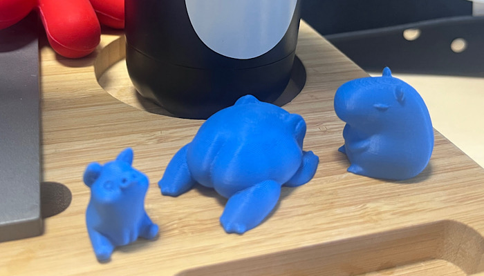
Well, my son got a 3D printer for Christmas. I can’t get my head around the whole concept of it, but he loves making these 3D-printed animals and nick nacks! They’re only small, but now I have a plethora of them on my desk – the collection grows every week! There’s a little piggy, a capybara… And I don’t know where he got the design from, but I’ve got a frog with a big booty.
Don’t we all?! Well, there’s no question in my mind, Kevin – the frog with a big booty knocks the penguin waterbottle into a cocked hat… And I don’t think anyone’s ever said that sentence before! Ha!
–
To stay in the loop with the latest news, interviews and features from the world of toy and game design, sign up to our weekly newsletter here
More Recent Interview

Designers Adrien Pédron and Thomas Favrelière on the origins of Archeo – and why Gigamic proved the perfect publisher
“We’d wanted to work with Gigamic for a long time…”: In conversation with designers Thomas Favrelière and Adrien Pédron.
BOTI’s Nico Blauw talks Pembe the Pink Cat, innovation – and the International Toy Board
“The look, the design, the audience, the messaging… It all appealed”: Nico Blauw reveals what made Pembe the Pink Cat a winner for BOTI.
“This was the missing piece…”: Rubber Road’s Jack Fox on TUBBZ’s move into blind collectibles with Mystery Eggs
Jack Fox, Sales & Marketing Director at Rubber Road, talks TUBBZ Mystery Eggs – and why Minions were a perfect fit.
Educational Insights’ Lisa Guili on TikTok, 20 years of Kanoodle – and ten million units sold
Lisa Guili reveals how one addictive brain teaser found its audience and became a phenomenon.

“I want people to bet on themselves”: Spin Master Co-Founder Ronnen Harary discusses his new book, No Experience Necessary
Spin Master Co-Founder Ronnen Harary talks to us about his exciting new book, working with inventors – and Spin’s most underrated launch.
David Norman of Stormin’ Studios on inventors, Orchard Toys – and shaking things up!
“It’s not just a name, it’s our mission statement”: In conversation with Stormin’ Studios’ David Norman.
Popular Articles
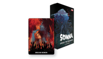
DSTLRY launches card game based on its award-winning Somna comic
BOTI’s Nico Blauw talks Pembe the Pink Cat, innovation – and the International Toy Board
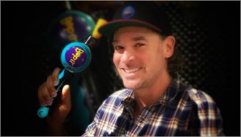
Bop It’s Dan Klitsner on creative techniques, his favourite inventions and more
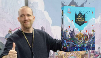
Pablo Clark discusses the six-year development journey behind the game design – and art – of The Old King's Crown

Mattel’s Tyler Kenney on bringing toyetic fun into fingerboarding with Hot Wheels Skate
Upcoming Events
-
- 30th January 2026
- Spielwarenmesse, Nuremberg
International Game Inventors Convention
-

- 19th - 21st May 2026
- Mandalay Bay Convention Center, Las Vegas
Las Vegas Licensing Expo
-
- 23rd - 25th June 2026
- Stamford Bridge Stadium, Chelsea, London
Play Creators Festival
-
- Tuesday, June 23rd, 2026
- Stamford Bridge Stadium, Chelsea, London
Play Creators Awards
-
- Wednesday, June 24th, 2026
- Stamford Bridge Stadium, Chelsea, London
Play Creators Conference
-
- Thursday, June 25th, 2026
- Stamford Bridge Stadium, Chelsea, London
Mojo Pitch
-

- 6th - 8th October 2026
- Excel London
Brand Licensing Europe